
Sub-Total: $0.00
More new colours extend Pantone potential
16 September 2026
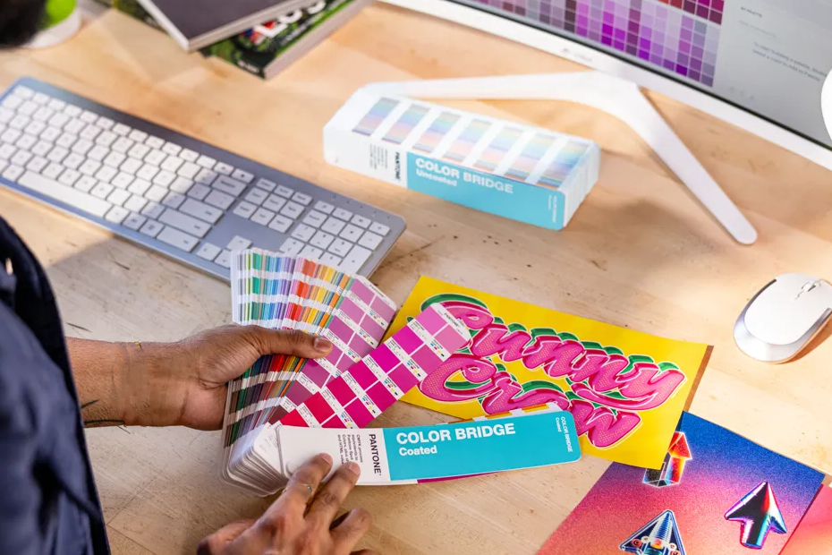
Pantone has introduced 224 new colours, available in both coated and uncoated paper stock, to the Pantone Matching System (PMS), expanding the library to nearly 9,000 colours, for graphic and product designers, brands, printers, converters, and ink manufacturers to choose from.
To develop the new collection, the Pantone Color Institute and Pantone’s group of colour scientists worked together to identify, curate and integrate the new colours into the PMS.
Joy Stempkowski, Product Manager, Graphics at Pantone, says “The expanded library gives our customers’ customers a broader, more precise language for specifying colour across the print workflow. And for printers, this facilitates stronger alignment from concept through press check: customers can identify the colour they want more accurately, printers can communicate achievable results more clearly, and both sides can reduce the compromise that often happens when a desired shade falls between existing options.”
The 224 new colours – curated ‘to further deepen every family in the system’ – are available immediately across the Pantone Formula Guide, Color Bridge, and Solid Chips Set. The range is also available digitally through Pantone Connect and the Pantone Connect Extension for Adobe Creative Cloud.
Stempkowski continues: “It was important to ensure that these new colours are also available across Pantone’s connected colour ecosystem. This allows creative teams to build palettes that include the new colours, share them across teams and workflows, and work with them directly within Adobe Creative Cloud applications. The result is greater consistency between creative intent, design development, and print production.”
“We are excited that the new colours also expand the palette in areas that feel especially relevant to today’s creative work. The range includes soft and bold blues, high-chroma pinks with vivid intensity, bright energising oranges, sophisticated greys and versatile neutrals. These are all colours that give designers, brands and printers more room to explore fresh ideas while still working within a trusted, production-ready colour system designed for clear communication, accurate matching and confident reproduction.”
Beyond the individual colours, Pantone has also translated its trend research into four ready-made palettes that show how the new shades come together. The names of the palettes are:
- Desire for Pleasure – featuring ‘sickly sweet colours as a playful indulgence’.
- Desire for Exquisite – ‘inspired by opulent blooms and ripened fruits’.
- Oxygenating – ‘a vibrant palette drawn from nature’s most brilliant hues – golden amber, neon citrus green, and lush botanical greens’.
- Beyond Boundaries – “a family of colour that has escaped the rules, including buoyant aqua, powdery lavender, magical purple, lime green, and creamy beige’.


Most read
- ORAFOL completes full acquisition of Group M.A.M.…
- Melbourne’s Mia Saker crowned as HEXIS PWS World PPF…
- EFI VUTEk® M3h X takes centre stage at PRINTING United Expo
- Women in Print confirms Calli McCool as Patron for…
- Avery Dennison adds colour to premium PPF market
- Big Mac Media ‘and AIs with that please’