Exotic Graphix – Turning the ordinary into the extraordinary!

Avery Dennison’s Global ‘Wrap Like a King’ winner Nick Caminiti is a mover and a shaker. For 11 years he has been in business, expanding his company to the powerhouse it is today. Since its humble beginnings as Exotic Kustoms, the company has grown to become Exotic Graphix – increasing in size, experience and expertise, with the support of family, suppliers, colleagues and of course, an amazing team.
In this article Colleen Bate provides a closer look into Nick’s world and wins, follows the trail of Exotic Graphix’s accelerated achievement within the custom and graphic design industry, and takes you through the process and production of one of its recent creative projects – the Shop Van wrap.
Pushing the boundaries – then and now
The journey of Exotic Graphix started out with passion, drive and the willingness to push the boundaries of creativity when Nick set up a factory in Carrum Downs in 2008. Partnering with a former colleague, he formed Exotic Kustoms with two spray booths, a printer, laminator and a few clients to get the business up and running.
The first year was challenging, but the following year proved successful, mainly due to the word-of-mouth client feedback it received. It was also the year Nick took his first overseas trip to the SEMA (Speciality Equipment Market Association) Show in Las Vegas, Nevada and decided to expand the business into the automotive sector.
After discovering matte black at the show, Nick decided to bring one roll back to Australia for testing. The new trend started slowly, but then swept interstate after patience and hard work. The SEMA Show has since become a regular and ever-expanding resource for research for Nick and his contacts overseas.
In 2011, Exotic Graphix had its big break as the only non-manufacturer to be invited to present at the Australian International Motorshow. Business boomed after Nick and his team showcased custom finished and fleet advertising. Knowing this side of the business was set to take off, Nick and his partner decided to separate. Focusing on custom vinyl and fleet vehicles, Nick moved down the street to bigger premises a few months later.
Winning back-to-back titles in Avery Dennison’s Global ‘Wrap Like A King’ Challenge in 2016 and 2017 added to Nick’s status and consequently heightened the company’s profile within the industry. The winning 2016 entry was Exotic Graphix’s 1930 Ford Tudor ‘Toxic Rat’. It was created from 58 templates (to get a flattened template of the 1930 Ford body), and the team designed and installed a full body wrap using traditional Hot Rod themed airbrush design and pin-striping, using 22 carat gold spun leaf for the stripe.
The winning entry the following year pushed the boundaries further. The 1963 Volkswagen Beetle ‘Lei’d Low’ custom designed and created wood-themed car, which showcased the extreme efforts involved in custom vehicle wrapping.
As can be seen, Exotic Graphics is unconventional – it does not do anything in a traditional way. This can be seen as a positive point of difference that continues to fuel the team’s drive to thrive and achieve client positive results in the custom, graphic design industry.
The Shop Van project: Anyone for a cigar?
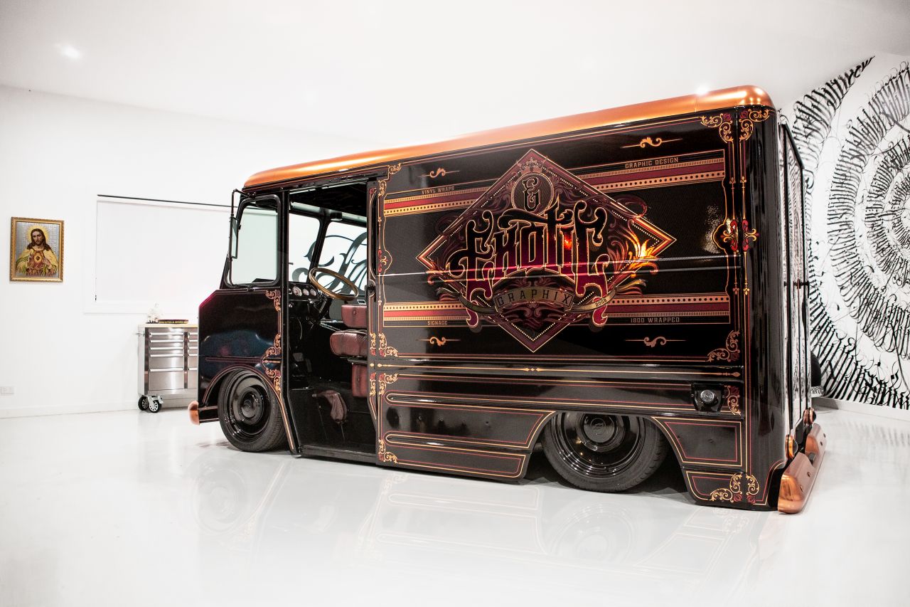
On the back of Exotic Graphix’s globally successful ‘Toxic Rat’ Tudor and ‘Lei’d low’ Bug, the company embarked on their next signature Exotic Graphix car project, the Shop Van. Expanding on the term ‘thinking outside the box’, they chose a box shaped vehicle as the template to create their ‘fully functional’ Shop Van concept with the perfect silhouette of a 1967 Chevrolet P10. Merging their expertise in creative and innovative vehicle wrap design and installation with their love for contemporary art, the finished ‘Cigar Lounge’ themed product is a blend of traditional brush art and digital imaging elegance.
When asked about the concept for the Shop Van, Nick explains that that style of truck has always been one of his favourites, as it is famous for being custom modified.
“After talking to a well renowned wrap company at SEMA about doing a van like that, I put it on my bucket list and started to search for a clean example of one to use as a base. The van orginally came from California but was quickly stripped down to its bare bones so we could create our end vision,” he says.
According to Nick there were a number of steps involved in the branding and design of the Shop Van.
“We wanted to use the van as a project to re-identify ourselves – the main goal was to show how we are able to collaborate with other companies and like minded artists,” he explains, admitting that the design was never actually set in stone and evolved once work was in progress.
“The first step was to get the stance and look right, so the airbags and all the mechanicals were the main part. This formed the foundation of the look we would want. From there we met a Melbourne artist named Mayonaize. He was amazing to deal with and his style is a mix between traditional lettering, and calligraphy with a tattoo/graffiti feel.
“Once we knew this was locked in, the scene was set for the rest of the design – 1930’s traditional lettering, with ornate styling was the direction. However, things escalated quite quickly and the van started to remind me of a bar. That’s when we decided to go with a ‘Cigar Lounge’ feel. The interior was completed first (with Mayonaize’s piece as the roof), we chose Mess Mate hardwood flooring by Killer Kreations and the seats were trimmed by WAD Upholstery who specialises in Chesterfield lounges. Steelies Wheel Co sponsored Exotic Graphix by supplying the 18-inch wheels on the van, which Nick is super grateful for.
A stereo by Phatt Audio Concepts set the ambience and a tool drawer that displays all the tools of trade needed for vinyl wrapping was installed,” he adds, pointing out and the list of other accessories needed for the project is too huge to mention.
“Moving to the exterior, we knew we had to get rid of the chrome. Initially gold was thrown in the mix but looked little tacky when we did samples, so we decided to make our own copper chrome. Once this was locked in, the logo was rendered up and set in stone so we could do all the fine details around it to make it a complete package – trying to resemble a cigar box/Arnotts’s biscuit tin. The fun began after this was locked in, as we got to decide on finishes and materials,” he says.
Nick takes us through the variety of materials he used for the project.
“The base wrap is digitally printed 3M 1080 Gloss Fierce Fuscia. It was a little bit of overkill but I really wanted to ensure people knew this wasn’t just overlaid decals so we created an airbrush shadow around all the graphic elements using this base film. Avery Satin black SWF was the next layer to use the copper to highlight off the gloss Fuscia print. The copper is digitally printed Avery ROSE gold chrome (sponsored by – Avery Dennison/Graphic Art Mart) we used our Roland printer for this to ensure we could get the colour to sit well on the rose gold to tint it more towards a burnt copper. We decide on matte laminate as this helped give a nicer sheen for the chrome print.
“To bring the print back to life we used the new Avery Paint Protection film as hotspot highlights. This worked well as it had a better lustre and more depth then just laminate. We achieved this look but we wanted more depth to the print, so we reached out to product branding design and development company, Duro-Lenz to see if we could achieve further hotspot highlights with their product. After some testing to see if we could get the product to hold in recesses we pulled the trigger to use their doming over our prints. This adds an amazing highlight to the van. By accident we noticed that it casts another shadow if you stick on top of the lensing. This only worked if it was a satin finish, so we put an additional layer on top of the lensing to give a little more depth,” he says.
Explaining the steps involved in printing, production and installation, Nick says: “The van was fully scanned in and templated first before we had a design in mind (just to ensure we had the best base to work to) then the job was shared across both our Roland XR640 and HP360 printers.
“Our new Zund G3 2500 played a big part in production as this helped us use the benefits of being able to cut registration points through cuts and labelling to help with install. In our experience, we are finding that the more prep work that is done in the initial stages of design and production make the install light work. Other than the copper wrapped roof, bars, grill, lights and lensed decals, the process was quite straight forward and smooth,” he confirms.
Nick says that another big challenge of the project during the install was the doming.
“It kept failing and popping out when we would test the product and its limits. We got Duro-Lenz to do a lighter coat of dome but still couldn’t get it to work so we made the design work in our favour over that area and also played with different adhesives to ensure we could lock it in place. So far so good!
“In regards to challengers outside the wrap, the engineering of the van would far out weigh the wrap. We wanted the van safe and fit for the employees to drive, so to get the car to meet the Vicroads standards and engineering was a long task. We’ve learnt a lot along the way!”
For Nick, the highlights of the project were working closely with his dad, Rocky, as they built the actual van together. The son and father duo worked late nights and weekends for months to get the van to the stage ready for the team to take over. “Second to that was seeing the team enjoy it all coming together and getting involved in the build,” he concludes.
“Nick and the team at Exotic Graphix continue to amaze with their innovation and workmanship in the car wrapping space. Their creativity and dedication to delivering market leading custom graphics to the market continues to inspire the industry. We are proud to be able to support Nick and his team as they continue to lead the way in this exciting space.” – Mark Canavan, Business Manager, Graphic Art Mart
“The van has been by far a major highlight in my printing career. From the moment Nick presented the idea I knew we would have our work cut out for us, but Nick is the right person to do this for, he knew there was a risk that it may not work out as he envisioned. But as you can see we worked together and struck gold. It was no walk in the park, but the results speak for themselves! What we did with our doming at Duro-Lenz only counts as a small portion of the blood, sweat and tears that went into his amazing van. I can’t wait for the next project!” – Dainah Caelli, Internal Sales, Duro-Lenz
(Note: Beautiful images of these cars were shot by Caprice Photography and can be viewed on “Our Latest Projects” section at http://exoticgraphix.com.au)


